Visualization
Visualizing more than one variable simultaneously requires special techniques.
| Methodology |
| Andrews Plot |
| Chernoff Faces |
| Matrix Plot |
| Marimekko Charts |
| Parallel Coordinates Plot |
| Star Glyphs and Sunray Plots |
| Ternary Plot |
| Trellis Plots |
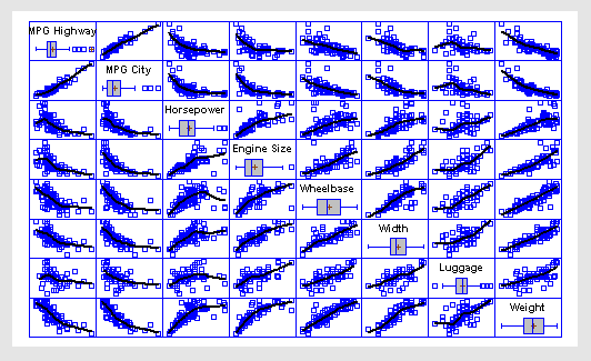
Matrix Plot
Matrix plots are used to display all pairs of X-Y plots for a set of quantitative variables. They are a good method for detecting pairs of variables that are strongly correlated. It is also possible to detect cases that appear to be outliers. The matrix plot above has two additions:
1. A box-and-whisker plot for each variable in the diagonal locations.
2. A robust LOWESS smooth for each plot, which highlights the estimated relationships between the variables.
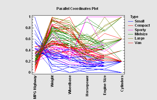
Parallel Coordinates Plot
The Parallel Coordinates Plot is a multivariate visualization technique that can be very useful in identifying differences and similarities amongst observed cases when the number of dimensions is too large to use a standard scatterplot. The line for the i-th row connects the standardized values of each variable in that row, where the standardized value equals the observed value minus the sample mean of that variable divided by the sample range.
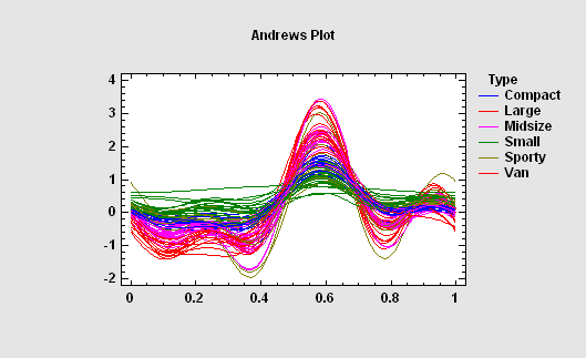
Andrews Plot
The Andrews Plot is similar to the Parallel Coordinates Plot, except that it encodes the information for each variable on a sine or cosine with different frequencies.
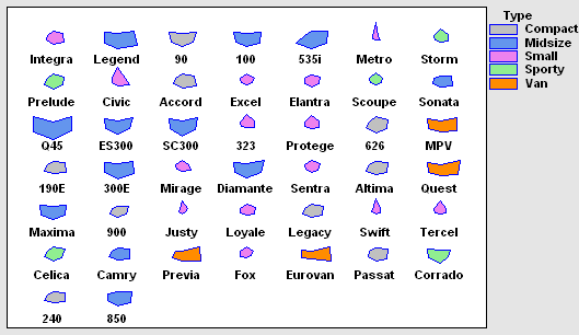
Star Glyphs and Sunray Plots
A glyph is a geometric object that represents the values of each quantitative variable. The size of the polygon in each direction is scaled according to the value of a specific variable. Cases with similar characteristics will have similar shapes.
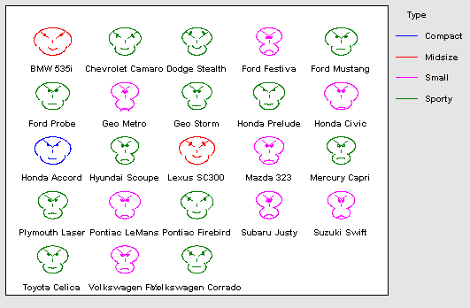
Chernoff Faces
Chernoff Faces provide a method for visualizing multivariate data by drawing cartoon faces in which various features are scaled according to the values of different quantitative variables. They were developed by Herman Chernoff and first described in the article titled “The Use of Faces to Represent Points in k-Dimensional Space Graphically”, published in 1973.While their effectiveness as a method for identifying groups of cases has been debated, they represent a novel alternative to more conventional multivariate visualization techniques.
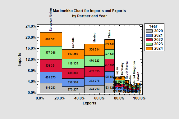
Marimekko Charts
Marimekko Charts are variable width barcharts used to display the distribution of quantitative variables across the levels of 1 or 2 categorical variables. There are several types of “mekko” charts, depending on the number of variables involved. Statgraphics creates charts for:
· 1 categorical factor and quantitative variable
· 1 categorical factor and 2 quantitative variables
· 2 categorical factor2 and 1 quantitative variable
· 2 categorical factor2 and 2 quantitative variables
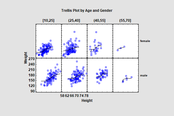
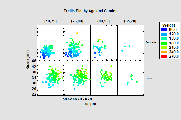
Trellis Plots
Trellis Plots are segmented plots that display data for each combination of one or more conditioning variables. For example, histograms of the distribution of height among individuals might be displayed side-by-side for men and women. The plots are designed to help users visualize how data change across levels of the conditioning variables.
Statgraphics provides 4 types of trellis plots:
1. Numeric Y: displays characteristics of a single quantitative variable at different combinations of 1 or 2 conditioning variables using either a histogram, box and whisker plot or normal probability plot.
2. Categorical Y: displays characteristics of a single categorial variable at different combinations of 1 or 2 conditioning variables using either a barchart, piechart or donut chart.
3. Y vs X: displays the relationship between 2 variables at different combinations of 1 or 2 conditioning variables using either a scatterplot or a regression curve.
4. Z vs X and Y: displays the relationship between 3 variables at different combinations of 1 or 2 conditioning variables using a bubble chart, a regression model, or a nonparametric smoother.
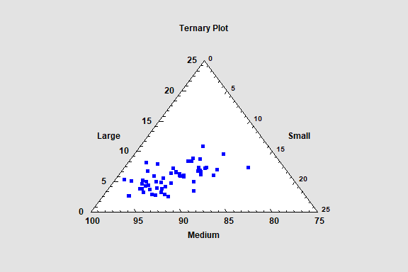
Ternary Plot
The Ternary Plot procedure may be used to create a scatterplot of 3 variables which always sum to a constant value. It shows the values of the variables on a plot shaped like an equilateral triangle. It is sometimes called a simplex plot or a de Finetti diagram. A common use in physical chemistry is to display the relative proportions of 3 components in samples of a mixture.