Other Version 20 Enhancements
Numerous other enhancements have been made in Version 20. Many are listed on this page.
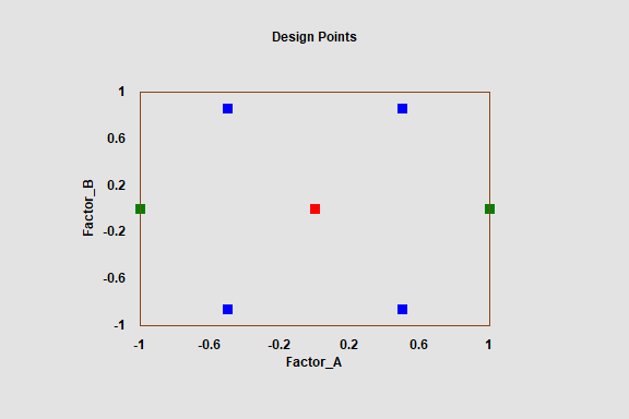
Design of Experiments - Doehlert Designs
Doehlert designs have been added to the catalog of experimental designs that may be created and analyzed in Statgraphics 20. These designs are a type of uniform space-filling design that may be used for response surface optimization. Compared to central composite and Box-Behnken designs, Doehlert designs are usually smaller. The predictive variance is also more uniform throughout a spherical region. However, the designs are not orthogonal.
Statgraphics 20 provides Doehlert designs ranging from a 7-run design for 2 factors through a 43-run design for 6 factors. The 7-run design is shown below:
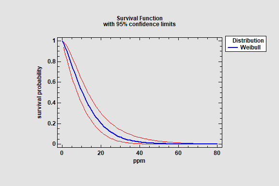
Distribution Fitting and Weibull Analysis
The Distribution Fitting (Censored and Uncensored data) and the Weibull Analysis procedure have been modified to include confidence intervals for distribution parameters, percentiles, and tail areas. The intervals are available when fitting the normal, lognormal, logistic, loglogistic, exponential, smallest extreme value and Weibull distributions. Sample output is shown below:

Excel and Minitab Import
Statgraphics 20 adds the ability to import workbooks and project files consisting of multiple worksheets. Previously, each worksheet needed to be imported separately. In addition, Statgraphics V20 can import any of the Minitab formats shown below:

Date-Time Formats
New date-time formats have been added to specify data in terms of milliseconds:

Operators
2 new operators have been added for use in Statgraphics expressions:
SORTASC(X,k) - sorts the data in column X and returns the first k (smallest) values.
SORTDESC(X,k) - sorts the data in column X and returns the first k (largest) values.
X may be either numeric or non-numeric.
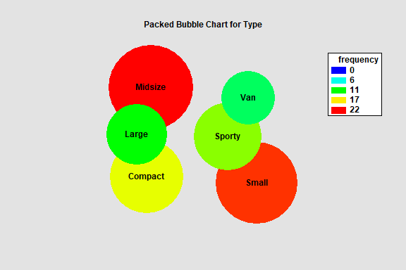
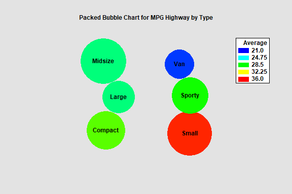
Tabulation and Frequency Tables
A new Packed Bubble Chart has been added to the Tabulation and Frequency Tables procedures. It displays a bubble for each level of the tabulated variable. The areas of the bubbles are proportional to the frequencies of each class, which is also indicated by a color palette ranging from blue to red.
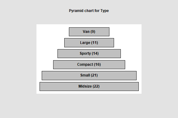
Other new charts include a funnel chart, a pyramid chart, and a rectangle area chart.
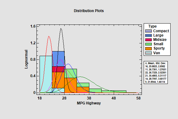
Subset Analysis

The fitted distributions for each subset may be displayed in a single plot.
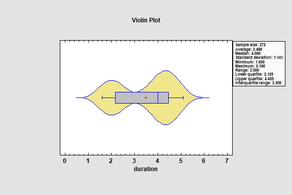
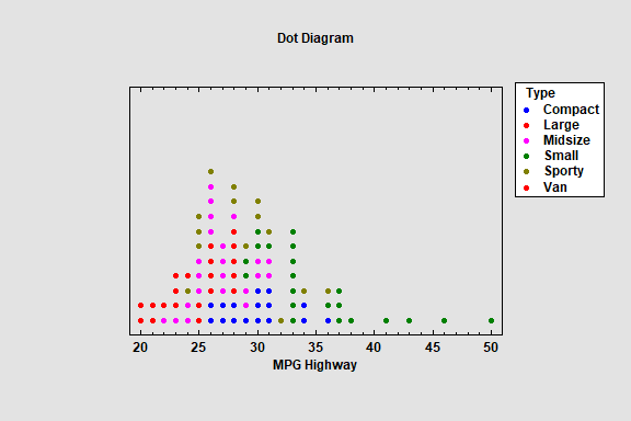
Trellis Plots
Four new options have been added to the trellis plots for quantitative variables:
1. Violin plots
2. Dot diagrams
3. Diamond plots
4. Summary statistics