Time Series Analysis and Forecasting
Many types of data are collected over time. Stock prices, sales volumes, interest rates, and quality measurements are typical examples. Because of the sequential nature of the data, special statistical techniques that account for the dynamic nature of the data are required.
Run Charts
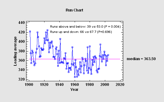
The Run Chart procedure plots data contained in a single numeric column. It is assumed that the data are sequential in nature, consisting either of individuals (one measurement taken at each time period) or subgroups (groups of measurements at each time period). Tests are performed on the data to determine whether they represent a random series, or whether there is evidence of mixing, clustering, oscillation, or trending.
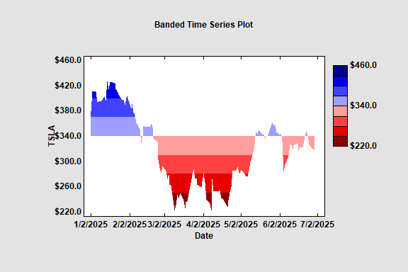
Banded Time Series Plot
The Banded Time Series Plot displays a time series with color coded bands. There are a selected number of bands above a specified centerline and the same number of bands below the centerline. A monochromatic palette is used to display any values that fall within the bands.
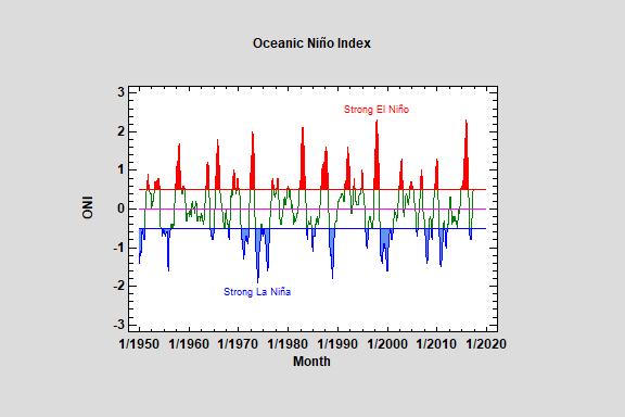
This procedure plots a time series in sequential order, identifying points that are beyond lower and/or upper limits. It is widely used to plot monthly data such as the Oceanic Niño Index.
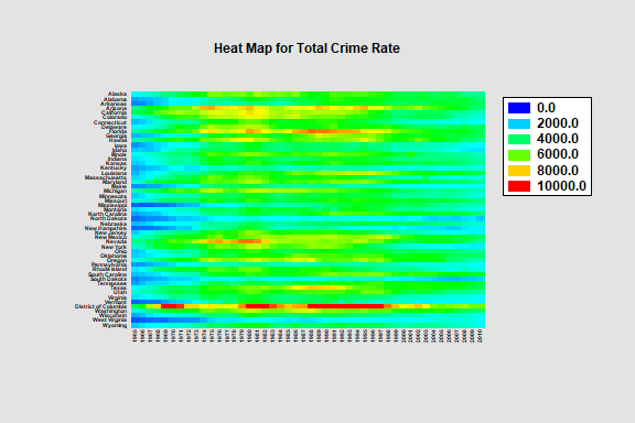
The Heat Map procedure shows the distribution of a quantitative variable over all combinations of 2 categorical factors. If one of the 2 factors represents time, then the evolution of the variable can be easily viewed using the map. A gradient color scale is used to represent values of the quantitative variable.
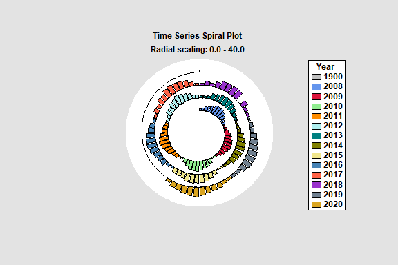
The Spiral Plot Statlet plots time series data along an Archimedean spiral that starts near the center of the plot and spirals outward. It is particularly helpful for displaying large amounts of data that exhibit a seasonal pattern. Data may be shown using bars, point, or lines. It is implemented as an animated Statlet that dynamically changes with time.
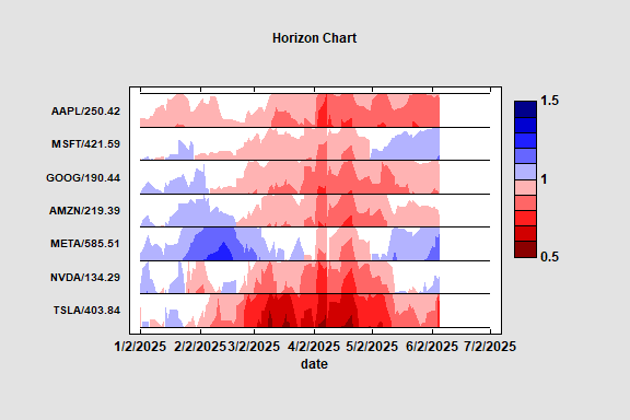
Horizon Charts
The Horizon Chart plots multiple time series data in a compact format. It is a visualization technique that can be used to identify interesting patterns within large datasets. Shades of blue and red are used to identify how far above or below a target value each time series is.
Descriptive Methods
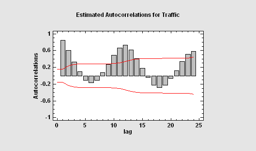
Characterizing a time series involves estimating not only a mean and standard deviation but also the correlations between observations separated in time. Tools such as the autocorrelation function are important for displaying the manner in which the past continues to affect the future. Other tools, such as the periodogram, are useful when the data contain oscillations at specific frequencies.
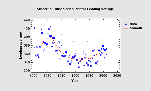
Smoothing
When a time series contains a large amount of noise, it can be difficult to visualize any underlying trend. Various linear and nonlinear smoothers may be used to separate the signal from the noise.
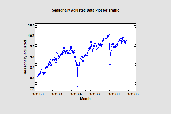
Seasonal Decomposition
When the data contain a strong seasonal effect, it is often helpful to separate the seasonality from the other components in the time series. This enables one to estimate the seasonal patterns and to generate seasonally adjusted data.
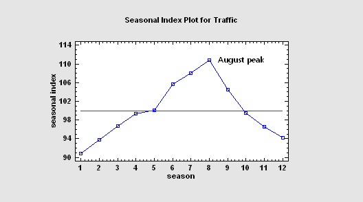
1. a trend-cycle component
2. a seasonal component
3. an irregular component
Each component may be plotted separately or saved, together with the seasonally adjusted data.
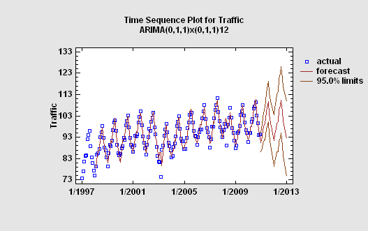
Forecasting (User-Specified Model)
A common goal of time series analysis is extrapolating past behavior into the future. The Statgraphics forecasting procedures include random walks, moving averages, trend models, simple, linear, quadratic, and seasonal exponential smoothing, and ARIMA parametric time series models. Users may compare various models by withholding samples at the end of the time series for validation purposes.
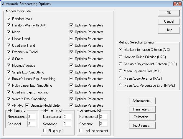
Forecasting (Automatic Model Selection)
If desired, users may elect to let Statgraphics select a forecasting model for them by comparing multiple models and automatically picking the model that maximizes a specified information criterion. The available criteria are based on the mean squared forecast error, penalized for the number of model parameters that must be estimated from the data. A common use of this procedure in Six Sigma is to select an ARIMA model on which to base an ARIMA control chart, which unlike most control charts does not assume independence between successive measurements. In such cases, the analyst may elect to consider only models of the ARMA(p,p-1) form, which theory suggests can characterize many dynamic processes.