Statistical Process Control Charts
One of the most important actions that can help maintain the quality of any good or service is to collect relevant data consistently over time, plot it, and examine the plots carefully. All statistical process control charts plot data (or a statistic calculated from data) versus time, with control limits designed to alert the analyst to events beyond normal sampling variability.
Basic Charts for Variable Data
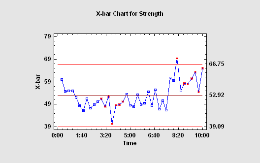
The classical type of control chart, originally developed back in the 1930's, is constructed by collecting data periodically and plotting it versus time. If more than one data value is collected at the same time, statistics such as the mean, range, median, or standard deviation are plotted. Control limits are added to the plot to signal unusually large deviations from the centerline, and run rules are employed to detect other unusual patterns.
Basic Charts for Attribute Data
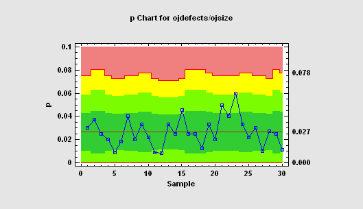
For attribute data, such as arise from PASS/FAIL testing, the charts used most often plot either rates or proportions. When the sample sizes vary, the control limits depend on the size of the samples. On most control charts, colored zones my be used to indicate the distance to 1, 2, and 3-sigma.
Control Charts for Overdispersed Counts
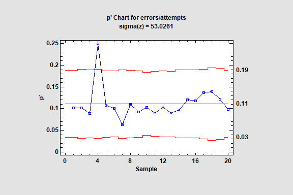
The P′ Chart procedure creates a control chart for data that describe the proportion of times an event occurs in m samples taken from a product or process. The data might represent the proportion of defective items in a manufacturing process, the proportion of customers that return a product, or any other event that has exactly 2 possible outcomes. Unlike the standard P chart, however, the P′ chart does not assume that the samples all come from a binomial distribution with the same mean. It instead allows the mean proportion to vary over the sampling period, a phenomenon known as overdispersion. The methodology used in constructing the chart is due to Laney (2002).
In a similar manner, the U′ Chart procedure creates a control chart for data that describe the number of nonconformities per unit recorded as the result of inspecting m samples. Unlike the U chart, the U′ chart does not assume that the samples all come from a Poisson distribution with the same mean. It instead allows the rate to vary over the sampling period.
Control Charts for Rare Events
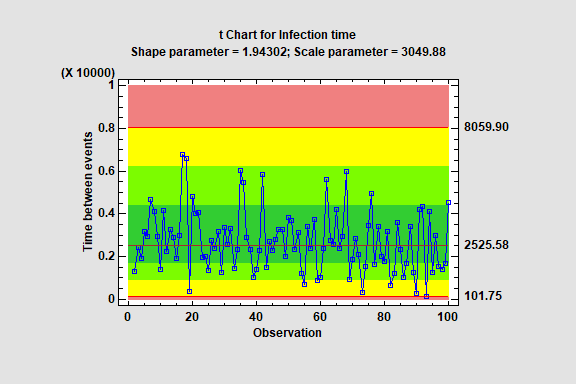
The T Chart procedure creates a control chart based on the intervals of time between the occurrence of rare events. It uses the Weibull distribution, which assumes that events occur at locations recorded in a continuous time scale. This type of chart is used frequently in the health sciences to monitor the occurrence of events such as post-surgical infections.
If events can only occur at discrete points in time (or are recorded at discrete locations such as a day), then a G Chart should be used in place of a T Chart.
Moving Average and EWMA Charts
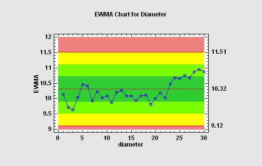
When data are collected one sample at a time and plotted on an individuals chart, the control limits are usually quite wide, causing the chart to have poor power in detecting out-of-control situations. This can be remedied by plotting a weighted average of the data instead of just the most recent observation. The most common "time-weighted" charts are the moving average (MA) chart and the exponentially weighted moving average (EWMA). The average run length of such charts is usually much less than that of a simple X chart.
Cumulative Sum Charts
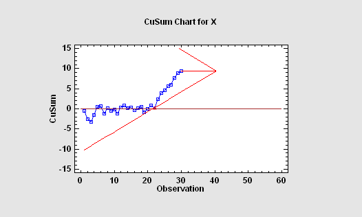
A useful chart for plotting measurements from a continuous process is the CUSUM chart, which plots at each time point the sum of all deviations from a target value up to and including the most recent observation. When the "V-mask" format for a Cusum chat is used, the process is deemed to be in control if all points on the chart fall within the mask. If any points fall outside the mask, as in the chart at the left, then an out-of-control alert is generated.
Multivariate Control Charts
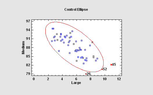
When more than one variable are collected, separate control charts are frequently plotted for each variable. If the variables are correlated, this can lead to missed out-of-control signals. For such situations, Statgraphics provides several types of multivariate control charts: T-Squared charts, Generalized Variance charts, and Multivariate EWMA charts. In the case of two variables, the points may be plotted on a control ellipse.
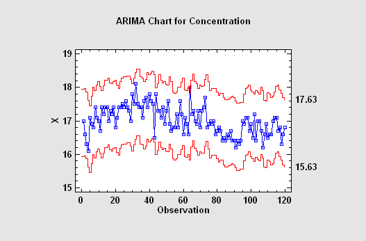
ARIMA Control Charts
With today's automated data collection systems, samples are frequently collected at closely spaced increments of time. Any sort of process dynamics introduces correlation into successive measurements, which causes havoc with standard control charts that assume independence between successive samples. In such cases, a control chart that captures the dynamics of the process must be used to properly detect unusual events when they occur. The proper chart for such situations is an ARIMA control chart, which is based upon a parametric time series model for process dynamics. Such charts either plot the residual shocks to the system at each time period, or they display varying control limits based upon predicted values one period ahead in time.
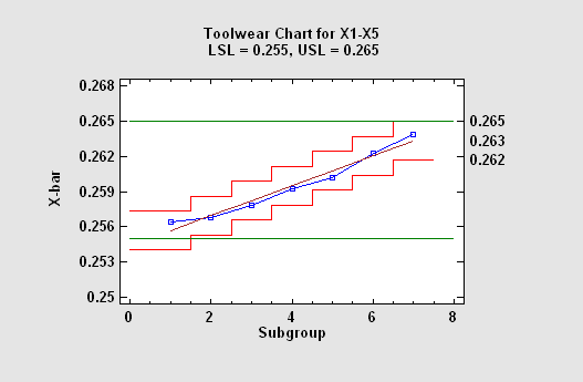
Toolwear Charts
Control charts can also be used to monitor processes in which the mean measurement is expected to change over time. This commonly occurs when monitoring the wear on a tool, but also arises in other situations. The control charts for such cases have a centerline and control limits that follow the expected trend.
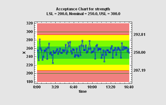
Acceptance Control Charts
For processes with a high Cpk, requiring the measurements to remain within 3 sigma of the centerline may be unnecessarily restrictive. In such cases, the process may be allowed to drift, as long as it does not come too close to the specification limits. A useful type of control chart for this case is the Acceptance Control Chart, which positions the control limits based on the specification limits rather than the process mean.
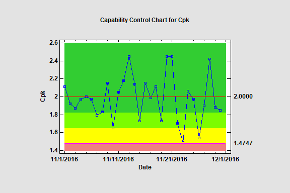
Control Chart for Capability Indices
This procedure constructs Phase II statistical process control charts for monitoring capability indices such as Cp and Cpk. Given a process that is deemed to be capable of satisfying stated requirements based on the analysis of variable data, these charts monitor continued compliance with those requirements.
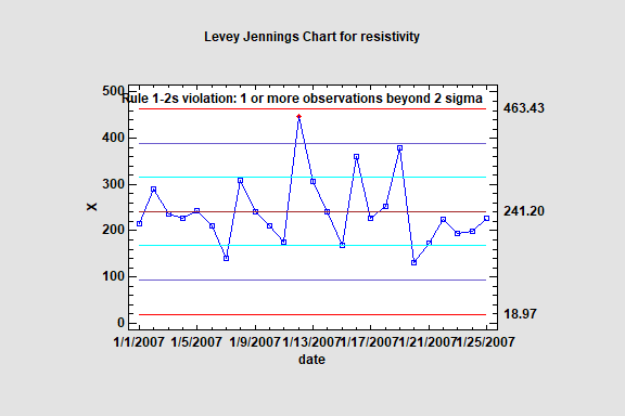
Levey-Jennings Charts
The Levey Jennings Chart procedure creates control charts for a single numeric variable where the data have been collected one-at-a-time. It is similar to the Individuals Control Charts procedure with the exception that it estimates the standard deviation of the process using the standard deviation of the entire data set, rather than a short-term estimate using the moving range. It creates both an X chart to monitor the process mean and a moving range (MR) chart to monitor the process variability. Out-of-control signals are highlighted, including both points beyond the control limits and any unusual runs in the data based on the Westgard Rules. The charts may be constructed in either Initial Study (Phase 1) mode, where the current data determine the control limits, or in Control to Standard (Phase 2) mode, where the limits come from either a known standard or from prior data.
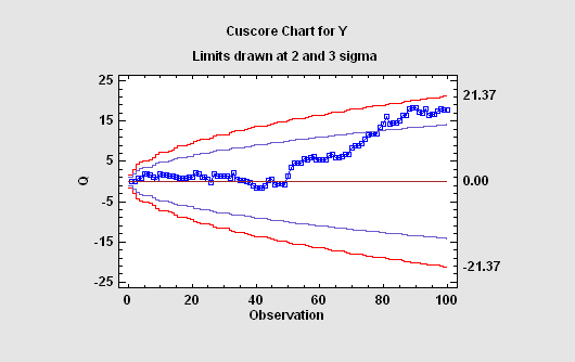
Cuscore Control Charts
When monitoring a real-world process, the types of out-of-control situations that are likely to occur may be known ahead of time. For example, a pump that begins to fail may introduce an oscillation into the measurements at a specific frequency. In such cases, specialized CuScore Charts may be constructed to watch for that specific type of failure. Statgraphiccs will construct CuScore charts to detect: spikes, ramps, bumps of known duration, step changes, exponential increases, sine waves with known frequency and phase, or any custom type of pattern that the user wishes to specify.
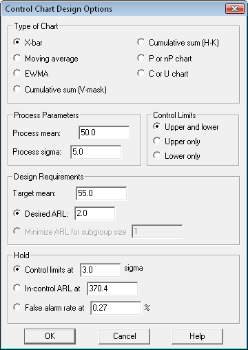
Control Chart Design
For a control chart to be effective, it must be able to distinguish between situations in which the process is operating as expected and those in which it has deviated seriously from its target values. Statgraphics provides a procedure for designing control charts that will detect deviations of a specified magnitude within an acceptable time. In a typical application, the user specifies a target mean and the desired average run length before a deviation of that magnitude is detected. The procedure then determines the number of samples and/or smoothing parameter that will achieve the desired performance.
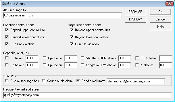
E-mail Alerts
The control chart procedures can be automated using the dynamic updating capabilities of the software. In such cases, it can be useful to generate e-mail alerts whenever an unusual event occurs. Alerts may be created when points on the control charts fall outside the control limits, or when a run rule is violated. If specification limits exist for the variable being plotted, alerts may also be generated whenever estimated capability indices fall below a threshold value or when the estimated DPM is too large.