Exploratory Data Analysis
Exploratory Data Analysis refers to a set of techniques originally developed by John Tukey to display data in such a way that interesting features will become apparent. Unlike classical methods which usually begin with an assumed model for the data, EDA techniques are used to encourage the data to suggest models that might be appropriate.
Box-and-Whisker Plots
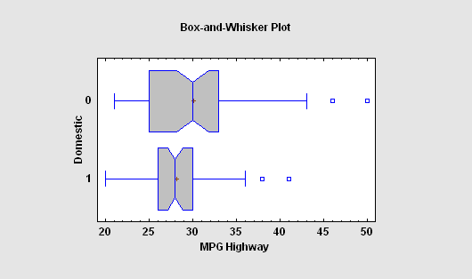
Box-and-whisker plots are graphical displays based upon Tukey's 5-number summary of a data sample. In his original plot, a box is drawn covering the center 50% of the sample. A vertical line is drawn at the median, and whiskers are drawn from the central box to the smallest and largest data values. If some points are far from the box, these "outside points" may be shown as separate point symbols. Later analysts have added notches showing approximate confidence intervals for the median, and plus signs at the sample mean.
Stem-and-Leaf Display
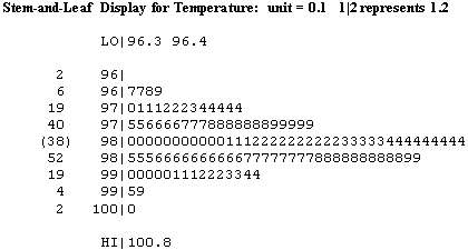
Stem-and-leaf displays take each data value and divide it into a stem and a leaf. For example, the temperature of the first subject in the data sample to the left had a body temperature of 98.4 degrees. The first two digits (“98”) are called the stem and plotted at the left, while the third digit (“4”) is called the leaf. Although similar to a histogram turned on its side, Tukey thought that the stem-and-leaf plot was preferable to a barchart since the data values could be recovered from the display.
Rootogram
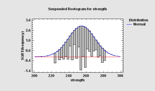
A rootogram is similar to a histogram, except that it plots the square roots of the number of observations observed in different ranges of a quantitative variable. It is usually plotted together with a fitted distribution. The idea of using square roots is to equalize the variance of the deviations between the bars and the curve, which otherwise would increase with increasing frequency. Sometimes, the bars are suspending the from the fitted distribution, which allows for easier visual comparison with the horizontal line drawn at 0, since visual comparison with a curved line may be deceiving.
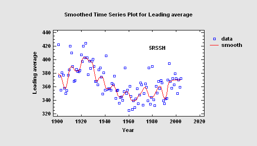
Resistant Time Series Smoothing
Tukey invented a number of nonlinear smoothers, used to smooth sequential time series data, that are very good at ignoring outliers and are often applied as a first step to reduce the influence of potential outliers before a moving average is applied. These include 3RSS, 3RSSH, 5RSS, 5RSSH, and 3RSR smoothers. Each symbol in the name of the smoother indicates an operation that is applied to the data.
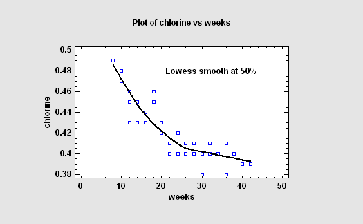
Scatterplot Smoothing
X-Y scatterplots may be smoothed using any of several methods: running means, running lines, LOWESS (locally weighted scatterplot smoothing), and resistant LOWESS. Smoothers are useful for suggesting the type of regression model that might be appropriate to describe the relationship between two variables.
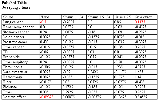
Median Polish
The Median Polish procedure constructs a model for data contained in a two-way table. The model represents the contents of each cell in terms of a common value, a row effect, a column effect, and a residual. Although the model used is similar to that estimated using a two-way analysis of variance, the terms in the model are estimated using medians rather than means. This makes the estimates more resistant to the possible presence of outliers.
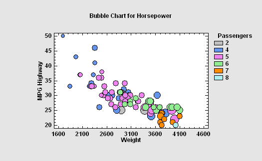
Bubble Chart
The Bubble Chart is an X-Y scatterplot on which the value of a third and possibly fourth variable is shown by changing the size and/or color of the point symbols. It is one way to plot multivariate data in 2 dimensions.
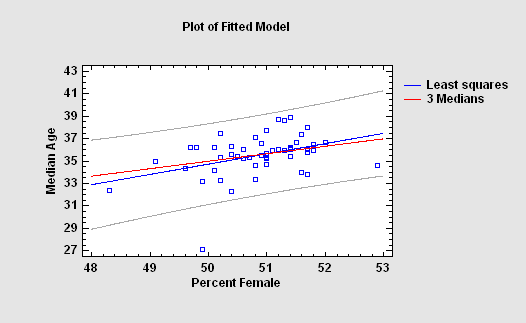
Resistant Curve Fitting
Tukey proposed a method for fitting lines and other curves that is less influenced by any outliers that might be present. Called the method of 3 medians, the data are first divided into 3 groups according to the value of X. Medians are then computed within each group, and the curve is determined from the 3 medians.
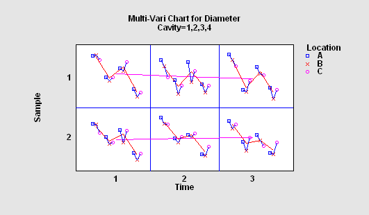
Multi-Vari Chart
A Multi-Vari Chart is a chart designed to display multiple sources of variability in a way that enables the analyst to identify easily which factors are the most important. It is commonly used to display data from a designed experiment prior to performing a formal statistical analysis.
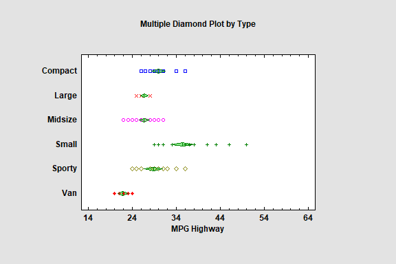
The Diamond Plot procedure creates a plot for a single quantitative variable showing the n sample observations together with a confidence interval for the population mean.
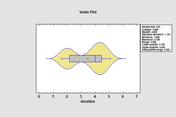
Violin Plot
The Violin Plot Statlet displays data for a single quantitative sample using a combination of a box-and-whisker plot and a nonparametric density estimator. It is very useful for visualizing the shape of the probability density function for the population from which the data came.
Waterfall Plot
Statgraphics creates 3 types of waterfall plots:
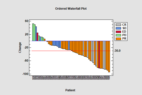
- Ordered Waterfall Plots are widely used to illustrate how a variable of interest increases or decreases amongst a sample of individuals. Data values are sorted and plotted as a barchart, usually with respect to a baseline equal to 0. A reference line may be added to the plot to display a target value. One common application in oncology shows the changes in tumor size in response to a drug.
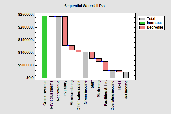
- Sequential Waterfall Plots are widely used to illustrate the cumulative effect of positive and negative contributions to a total value. Bars are drawn representing each contribution as well as totals and subtotals. Applications include financial analysis, inventory analysis, performance analysis, hiring, and demographics.
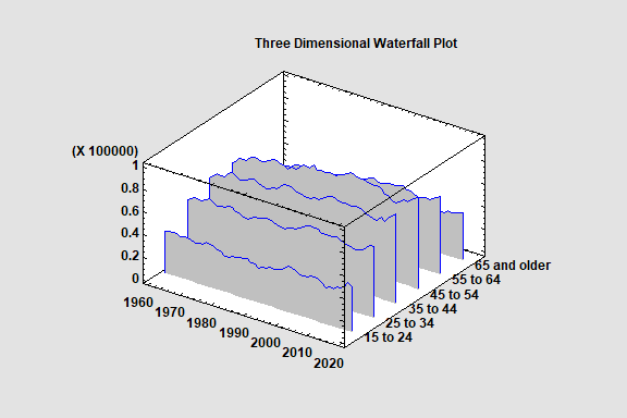
- Three Dimensional Waterfall Plots are widely used to display multiple columns of data versus a common variable. One commonly encountered example is a Cumulative Spectral Decay plot, in which spectra are plotted at multiple times to illustrate changes in amplitude as a function of both frequency and time. In general, the plots are used to show changes in a quantitative variable versus both time and some other factor.
Heat Map
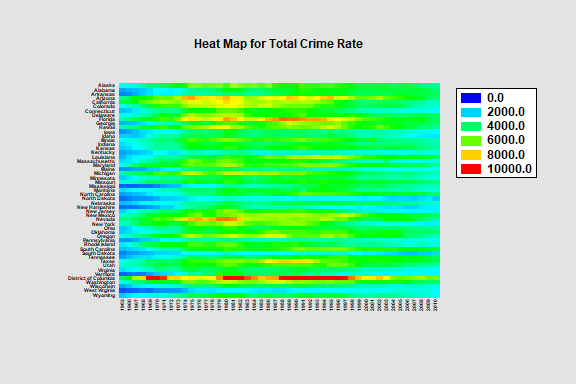
The Heat Map procedure shows the distribution of a quantitative variable over all combinations of 2 categorical factors. If one of the 2 factors represents time, then the evolution of the variable can be easily viewed using the map. A gradient color scale is used to represent values of the quantitative variable.
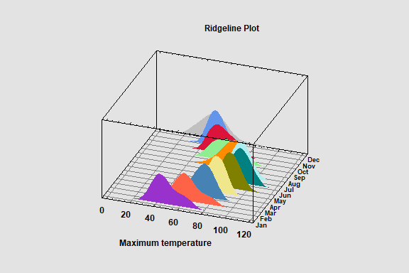
Ridgeline Plots
The Ridgeline Plots display the distribution of a numeric variable across multiple levels of a categorical factor. They may include histograms, fitted distributions, and nonparametric density estimates. The plots are implemented as interactive Statlets. Both 2D and 3D versions are available.
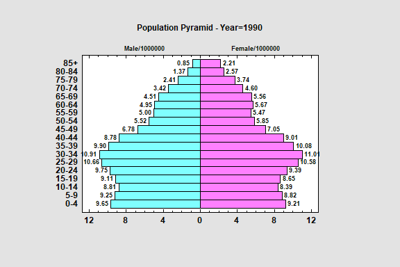
Population Pyramid
The Population Pyramid Statlet is designed to compare the distribution of population counts (or similar values) between 2 groups. It may be used to display that distribution at a single point in time, or it may show changes over time in a dynamic manner. In the latter case, various options are offered for smoothing the data and for dealing with missing values.