Data Visualization
Statgraphics Centurion is widely known for containing many types of graphs for visualizing data. From standalone 2D charts to dynamic 3D renderings, the variety of methods is unmatched by any other analytic software.
Statgraphics 20 adds a collection of new methods designed for displaying data that frequently arise in business and research environments. Each new charting technique is described below.
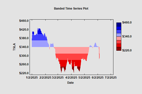
Banded Time Series Plot
A Banded Time Series Plot displays a time series with color coded bands. There are a selected number of bands above a specified centerline and the same number of bands below the centerline. A monochromatic palette is used to display any values that fall within the bands. The plot below shows closing prices of TSLA common stock.
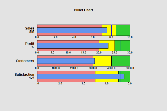
Bullet Charts
Bullet charts are a special type of barchart that are commonly used to display the performance of a process with respect to multiple
features. The chart displays the current status of each feature and compares it
to a target value. Often, the bars are divided into three regions corresponding
to poor, average or outstanding performance.
The smaller blue bars in the plot below show the current values of each feature. The solid lines show the target values. The poor, average and outstanding regions are shaded in red, yellow and green, respectively.
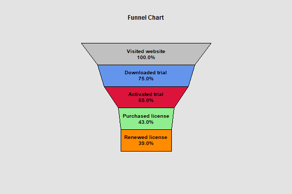
Funnel Charts
Funnel charts are another special type of barchart that are commonly used to display how
a numeric value changes over sequential stages of a process. Examples include
stages of purchasing a product on a website and recruiting of new employees. Funnel
charts are commonly added to dashboards.
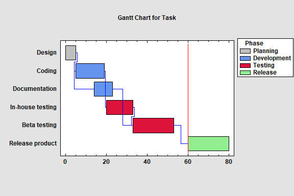
Gantt Charts
A Gantt chart is a special type of plot commonly used to display a project
schedule. It contains horizontal bars
depicting the start and end times of a set of tasks that need to be
accomplished to complete the project. It also contains lines showing which
tasks need to be completed before other tasks can begin. A vertical line may
also be added to the chart representing the current date.
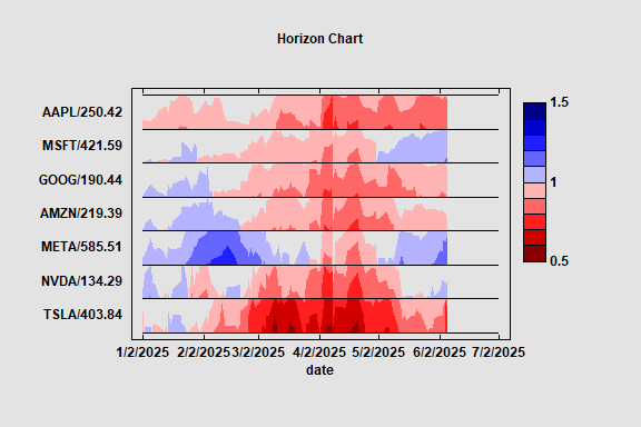
Horizon Chart
The Horizon Chart plots multiple time series data in
a compact format. It is a visualization technique that can be used to identify
interesting patterns within large datasets. Shades of blue and red are used to
identify how far above or below a target value each time series is.
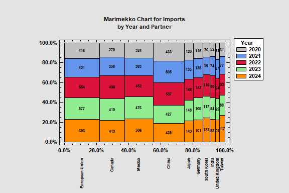
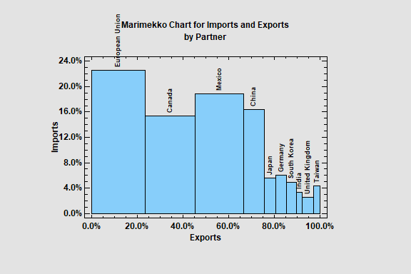
Marimekko Charts
Marimekko charts are variable width barcharts used to display the
distribution of quantitative variables across the levels of 1 or 2 categorical
variables. There are several types of “mekko” charts, depending on the number
of variables involved. Statgraphics creates charts for either 1 or 2 quantitative variables by levels of either 1 or 2 categorical factors.
The first example shows the percentage of import (height of the bars) and exports (width of the bars) for the U.S.A. during 2024 for each of its largest trading partners.
The second example shows U.S. imports by trading partner for 5 recent years.
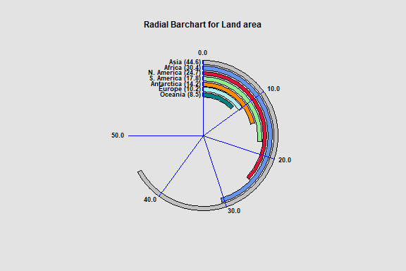
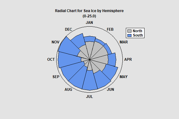
Radial Barcharts
Radial barcharts display data using charts with circular axes. Radial barcharts are commonly added to dashboards since they tend to be quite compact.
There are 2 types of radial barcharts. The first displays data using circular bars rather than rectangular bars. Note that the primary axis in this type of chart runs from the 12 o-clock position to the 9 o-clock position.
The second type of radial barchart draws bars in the radial direction. The plot below shows the amount of sea ice for each month of 2022 in both the northern and southern hemispheres. Such a chart works well for seasonal data.
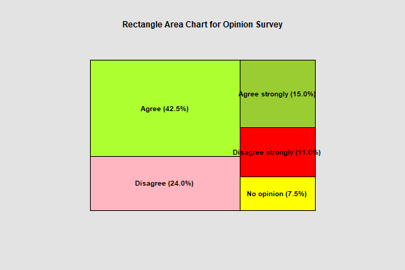
Rectangle Area Chart
A rectangle area chart is a barchart is which the areas are scaled according to the data values. The chart below is a typical example created to display the results of a survey question.
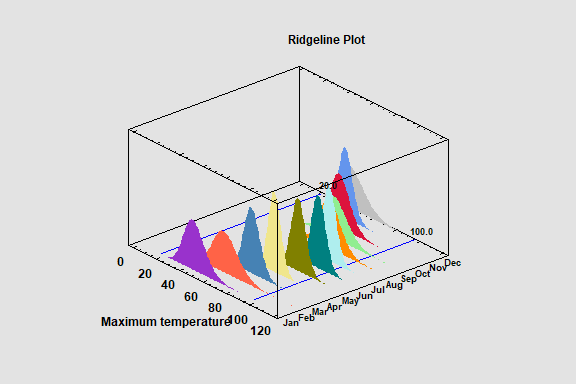
Ridgeline Plots
Ridgeline Plots display the distribution of a numeric variable
across multiple levels of a categorical factor. They may include histograms,
fitted distributions, and nonparametric density estimates. The plots are
implemented as interactive Statlets. Both 2D and 3D versions are available.
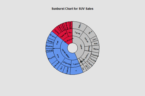
Sunburst Charts
Sunburst charts are designed to display hierarchical data. Such
data has a parent-child relationship, with each level of the child factor being
a subset of a parent factor. The chart below shows the number of SUVs sold in the United States during 2024. The hierarchical levels consist of country, make and model.
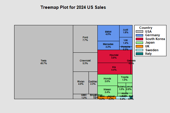
Treemaps
A treemap is a rectangular display of hierarchical
data. As with the sunburst chart, it is designed for data that has a parent-child relationship, with each level of the child
factor being a subset of a parent factor. The area of each rectangle is proportional to the sales of a particular EV in the U.S. during 2024. The models are grouped by country.