Categorical Data Analysis
Categorical data is data that classifies an observation as belonging to one or more categories. For example, an item might be judged as good or bad, or a response to a survey might includes categories such as agree, disagree, or no opinion.
Tabulation
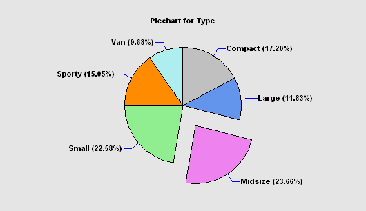
The Tabulation procedure is designed to summarize a single column of attribute data. It tabulates the frequency of occurrence of each unique value within that column. The frequencies are displayed both in tabular form and graphically as a barchart or piechart.
Frequency Tables
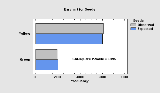
The Frequency Tables procedure analyzes a single categorical factor that has already been tabulated. It displays the frequencies using either a barchart or piechart. Statistical tests may also be performed to determine whether the data conform to a set of multinomial probabilities.
Crosstabulation
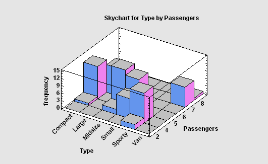
The Crosstabulation procedure is designed to summarize two columns of attribute data. It constructs a two-way table showing the frequency of occurrence of all unique pairs of values in the two columns. Statistics are constructed to quantify the degree of association between the columns, and tests are run to determine whether or not there is a statistically significant dependence between the value in one column and the value in another. The frequencies are displayed both in tabular form and graphically as a barchart, mosaic plot, or skychart.
Contingency Tables
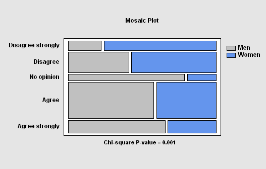
The Contingency Tables procedure is designed to analyze and display frequency data contained in a two-way table. Such data is often collected as the result of a survey. Statistics are constructed to quantify the degree of association between the rows and columns, and tests are run to determine whether or not there is a statistically significant dependence between the row classification and the column classification. The frequencies are displayed both in tabular form and graphically as a barchart, mosaic plot, or skychart.
Median Polish
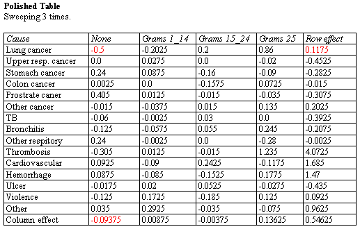
The Median Polish procedure constructs a model for data contained in a two-way table. The model represents the contents of each cell in terms of a common value, a row effect, a column effect, and a residual. Although the model used is similar to that estimated using a two-way analysis of variance, the terms in the model are estimated using medians rather than means. This makes the estimates more resistant to the possible presence of outliers.
Correspondence Analysis
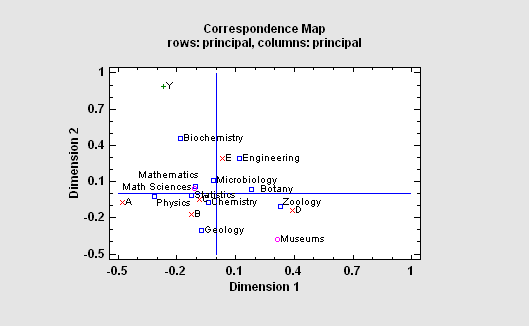
The Correspondence Analysis procedure creates a map of the rows and columns in a two-way contingency table for the purpose of providing insights into the relationships amongst the categories of the row and/or column variables. Often, no more than two or three dimensions are needed to display most of the variability or “inertia” in the table. An important part of the output is a correspondence map on which the distance between two categories is a measure of their similarity.
Multiple Correspondence Analysis
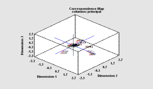
The Multiple Correspondence Analysis procedure creates a map of the associations among categories of two or more variables. It generates a map similar to that of the Correspondence Analysis procedure. However, unlike that procedure which compares categories of each variable separately, this procedure is concerned with interrelationships amongst the variables. For a complex map such as that to the right, rotate, zoom and pan operations can be very helpful.
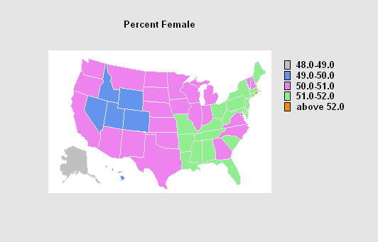
Map by State
The Map by State procedure creates a plot of the United States on which each state and the District of Columbia are color-coded according to the value of a selected attribute or variable. A table is also created summarizing the number of states falling in each group. If a weighting factor is specified, the sum of the weights in each group is also displayed.
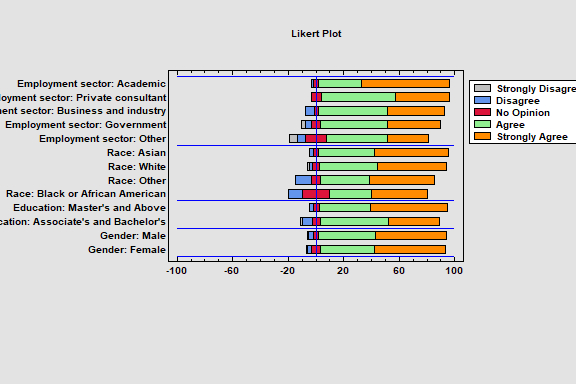
Likert Plot
The Likert Plot procedure analyzes data recorded on a Likert scale. Likert scales are commonly used in survey research to record user responses to a statement. A typical 5-level Likert scale might code user responses ranging from 1 for strongly disagree to 5 for strongly agree. The analysis calculates summary statistics and displays the results using a diverging stacked barchart.
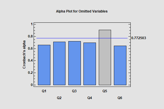
Item Reliability Analysis
The Item Reliability Analysis is designed to estimate the reliability or consistency of a set of variables. It is commonly used to assess how well a set of questions in a survey, each of which is designed to illicit information about the same characteristic, give consistent results.
The major output of the procedure is Cronbach’s alpha. Alpha may be calculated directly from the input variables, or the variables may first be standardized so that they have equal variances. The effect on alpha when each variable is separately omitted is also estimated, so that unreliable questions can be identified.
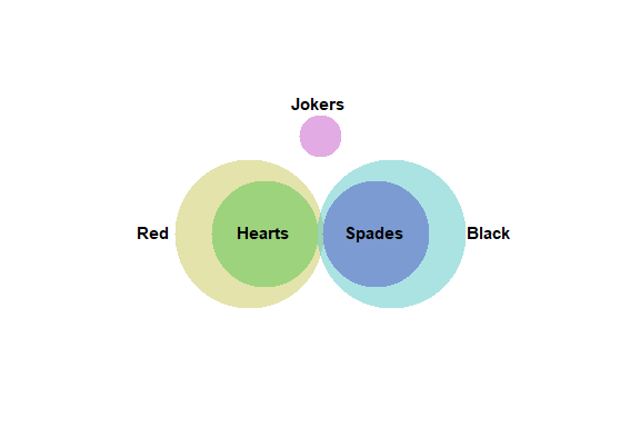
Venn and Euler Diagrams
The Venn and Euler Diagrams procedure creates diagrams that display the relative frequency of occurrence of discrete events. They consist of circular regions that represent the frequency of specific events, where the overlap of the circles indicates the simultaneous occurrence of more than one event.
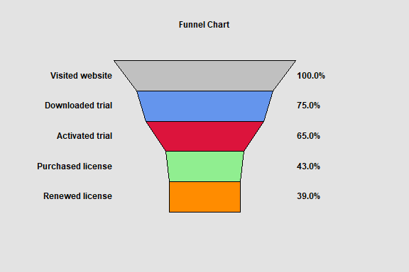
Funnel Chart
The Funnel Chart procedure creates a special type of barchart that is commonly used to display how a numeric value changes over sequential stages of a process. Examples include stages of purchasing a product on a website and recruiting of new employees. Funnel charts are commonly added to dashboards.
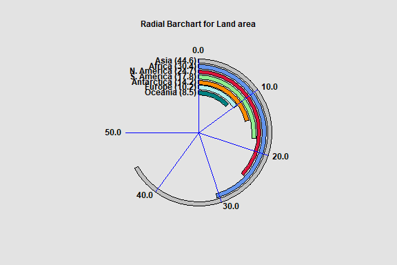
Radial Barchart
The Radial Barchart procedure creates a barchart in which the bars are circular rather than rectangular. Radial barcharts are commonly added to dashboards.
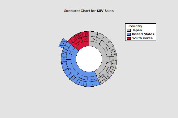
Sunburst Chart
The Sunburst Chart procedure is designed to display hierarchical data. Such data has a parent-child relationship, with each level of the child factor being a subset of a parent factor. The procedure handles data with up to 10 factors.
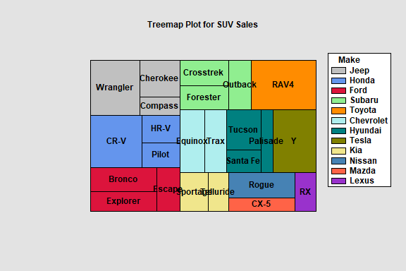
The Hierarchical Treemap procedure creates a rectangular display for hierarchical data. Such data has a parent-child relationship, with each level of the child factor being a subset of a parent factor. The procedure handles data with either 1 factors or 2 child factors.
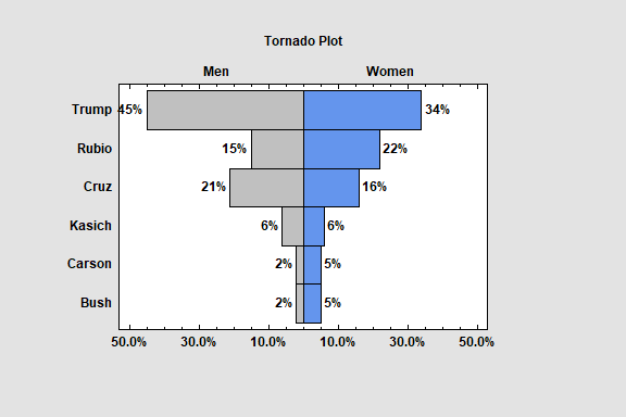
Tornado and Butterfly Plots
The Tornado and Butterfly Plots procedure creates two similar plots that compare 2 samples of attribute data. Each plot consists of 2 sets of bars that show the frequency distribution of each sample over a set of categories. The only difference between the plots is where the labels are placed.
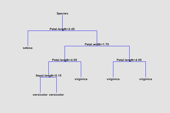
Classification and Regression Trees
The Classification and Regression Trees procedure implements a machine-learning process to predict observations from data. It creates models of 2 forms:
1. Classification models that divide observations into groups based on their observed characteristics.
2. Regression models that predict the value of a dependent variable.
The models are constructed by creating a tree, each node of which corresponds to a binary decision. Given a particular observation, one travels down the branches of the tree until a terminating leaf is found. Each leaf of the tree is associated with a predicted class or value.
Observations are typically divided into three sets:
1. A training set which is used to construct the tree.
2. A validation set for which the actual classification or value is known, which can be used to validate the model.
3. A prediction set for which the actual classification or value is not known but for which predictions are desired.
The dependent variable may be either categorical or quantitative, as may the predictor variables.